

The best mobile website builder for most people is Wix — it gives you a dedicated mobile editor where you can design your phone experience independently from your desktop site, has a full-featured mobile app for managing your site on the go, and its AI system automatically optimises layouts for every screen size. For the most consistently polished mobile templates with zero configuration, Squarespace is the stronger choice — every template is designed mobile-first and looks exceptional on a phone without any manual adjustment. For speed, budget, and the fastest mobile load times tested, Hostinger starts at $2.99 per month and outperforms both Wix and Squarespace on Google's Core Web Vitals mobile scores.
We tested eight website builders specifically for mobile — using real Android and iOS devices, not just desktop preview modes. We checked template responsiveness, mobile editing apps, touch interaction quality, load times on 4G connections, and how each platform handles Google's mobile-first indexing. Here is what we found.
If you're comparing platforms more broadly, see our guide to the Best Website Builder and Hosting for Small Business.
Why Mobile Optimisation Is Now Your Most Important Website Decision
Over 60% of web traffic comes from mobile devices. That is not a prediction — it is the current reality. More than half the people who will ever visit your website will do so on a phone, in a browser window roughly 390 pixels wide, with a thumb instead of a mouse and a 4G connection instead of fibre broadband.
Since 2020, Google has used mobile-first indexing, meaning your website's mobile version is the primary one that determines your ranking in search results. Your rank will drop on all devices — including desktop — if your mobile site is slow, broken, or hard to use.
According to Google Consumer Insights, if a website takes more than three seconds to load, more than half of mobile users will leave the page. That 53% abandonment rate is not a minor inconvenience — it is a direct hit to every business metric your website is supposed to improve.
The implication is clear: choosing a website builder that handles mobile well is no longer optional. It is the primary technical decision affecting your ability to rank on Google, retain visitors, and convert them into customers.
Many modern builders now include artificial intelligence features to optimise layouts automatically. Our guide to the Best AI Website Builders explains how these tools work.
Responsive vs Mobile-First — The Distinction That Matters
Most website builders claim to be "mobile-friendly." That term covers a wide range of quality, and understanding the difference matters before you choose a platform.
Responsive design means your website scales and rearranges itself automatically to fit any screen size. This is the baseline. Every builder on this list does it. But responsive alone does not guarantee a good mobile experience — it just means the site does not break on a phone. Elements that look great at 1440px wide can still feel cramped, mis-sized, or awkward at 390px, even on a responsive site.
Mobile-first design means the mobile experience was the primary design consideration — the site was built for a small screen and then scaled up to desktop, rather than the other way around. Mobile-first sites tend to have faster load times, cleaner layouts on phones, and touch interactions that feel natural rather than transplanted from a mouse-driven interface.
In 2026, shrinking a desktop site to fit on a mobile device is no longer enough — mobile-first design is now the standard for any brand wanting to perform well online.
When evaluating each builder below, we have specifically noted which ones offer true mobile-first design control and which ones offer responsiveness that you then manually adjust.
What to Look for in a Mobile Website Builder
Separate Mobile Editor
The best builders give you independent control over your mobile layout — the ability to rearrange sections, hide elements that do not work on small screens, resize text and images specifically for mobile, and preview exactly what visitors on a phone will see. This level of control produces significantly better mobile experiences than builders that only let you adjust the shared desktop-mobile template.
Mobile Management App
If you run a business, you will want to update your website, check analytics, respond to enquiries, and manage orders from your phone — not just build the site from your desktop. A strong mobile management app is a genuine practical advantage for any business owner who is not always at a computer.
Core Web Vitals Performance
Google scores every website on three Core Web Vitals metrics: Largest Contentful Paint (how fast the main content loads), Cumulative Layout Shift (how stable the layout is as it loads), and Interaction to Next Paint (how quickly the site responds to touch). These scores directly affect your Google rankings. We checked real Core Web Vitals scores for each platform below.
Touch-Optimised Interactions
Navigation menus, buttons, and form fields designed for a mouse cursor often create friction on a touchscreen. Tap targets that are too small, buttons too close together, and forms that do not trigger the correct mobile keyboard — these are real usability problems that turn visitors away before they convert. The best mobile builders handle all of this automatically.
Mobile-First Templates
Templates that are designed starting from the mobile view — with font sizes, spacing, and image crops chosen for a 390px screen — look noticeably better on phones than templates adapted from a desktop layout. We noted which platforms lead here.
Quick Comparison — Best Mobile Website Builders
Builder | Mobile Editor | Management App | Core Web Vitals | Mobile-First Templates | Starting Price |
|---|---|---|---|---|---|
Wix | ✅ Separate mobile editor | ✅ iOS + Android | Good | ✅ Yes | $17/month |
Squarespace | ⚠️ Shared editor, device preview | ✅ iOS + Android | Good | ✅ Best-in-class | $16/month |
Hostinger | ✅ Separate mobile controls | ✅ iOS + Android | ✅ Best tested | ✅ Yes | $2.99/month |
Wix Studio | ✅ True responsive breakpoints | ✅ iOS + Android | Good | ✅ Advanced | $17/month |
GoDaddy | ⚠️ Auto-responsive | ✅ iOS + Android | Moderate | ✅ Yes | $9.99/month |
Webflow | ✅ Full breakpoint control | ❌ No app | ✅ Excellent | ✅ Yes | $14/month |
Shopify | ⚠️ Auto-responsive | ✅ iOS + Android | Good | ✅ Yes | $29/month |
SITE123 | ⚠️ Auto-responsive | ❌ Limited | Moderate | ✅ Yes | Free / $12.80/month |
The 8 Best Mobile Website Builders — Full Reviews
1. Wix — Best Overall Mobile Website Builder
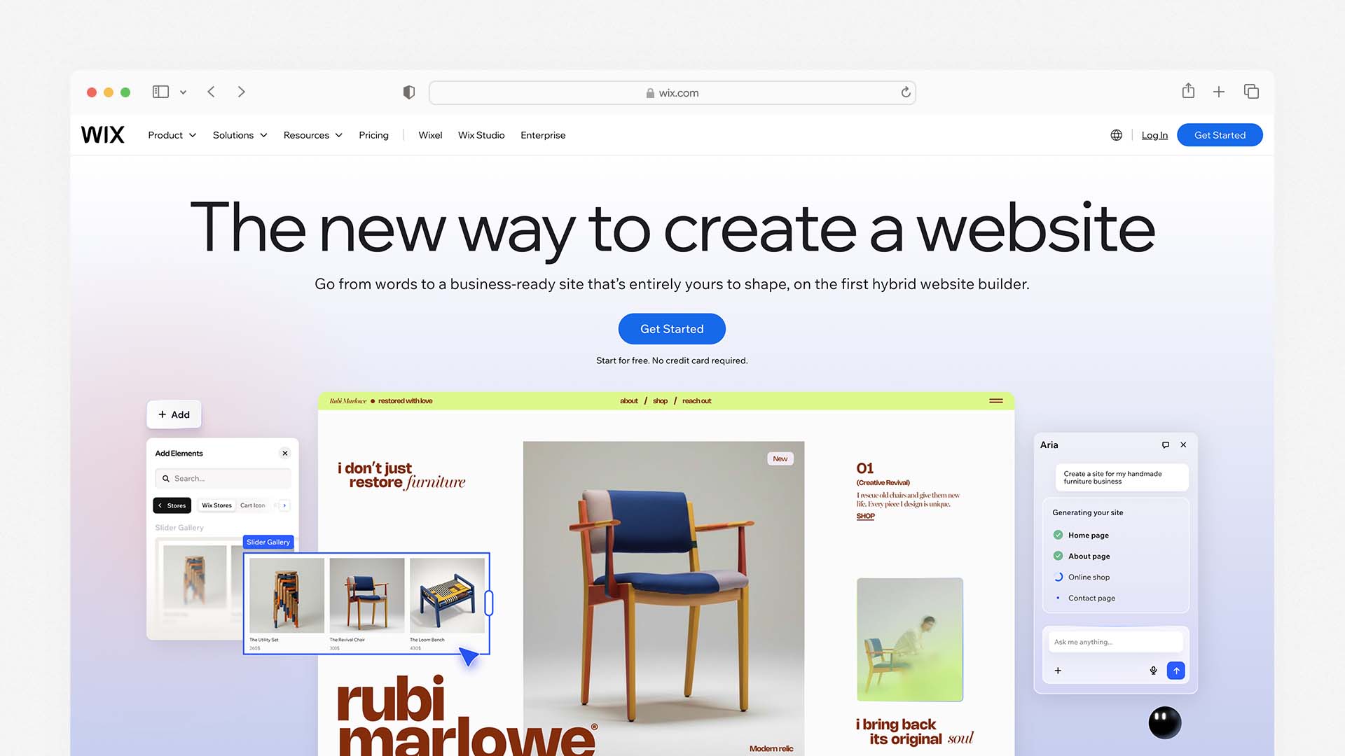
Wix is the best all-around mobile website builder because it combines the most granular mobile editing controls of any hosted builder with a full-featured management app, strong Core Web Vitals performance, and an AI system — Wix Harmony — that adjusts layouts, font sizes, and section spacing for mobile automatically when you make desktop changes.
Wix also ranks as the best overall platform in our comparison of the Best AI Website Builders.
The defining feature for mobile is Wix's separate mobile editor. When you switch to mobile view in the Wix editor, you are not just previewing your desktop design scaled down — you are editing a distinct mobile layout. You can hide sections that do not translate well to a small screen, rearrange the order of content blocks, resize images, adjust text sizes independently, and add mobile-only elements like a sticky click-to-call button. This control is genuinely rare among hosted builders and produces mobile experiences that feel purpose-built for phones rather than adapted from a desktop design.
Wix gives you full creative control over your mobile design, including 2,500+ templates and a powerful drag-and-drop mobile editor. The mobile editor also includes a dedicated mobile menu designer where you can configure how your navigation appears on small screens — choosing between a hamburger menu, a tab bar at the bottom of the screen, or a full-screen overlay navigation.
The Wix Owner app (available for iOS and Android) is one of the strongest mobile management apps on this list. From your phone you can publish new pages, write and schedule blog posts, update product listings, view real-time analytics, respond to customer messages, manage bookings, and process orders. For a business owner who needs to manage their website between client meetings and site visits, this level of mobile management access is genuinely practical.
For Wix Studio — Wix's professional-tier builder for agencies and advanced users — the mobile experience adds true responsive breakpoints: you can set specific layouts for desktop, tablet, and mobile independently, with pixel-level control over how each element behaves at each screen width. This is the closest a no-code builder gets to how professional developers implement responsive design. Wix Studio includes responsive AI to aid in adjustments for smaller screens, integrated collaboration tools for team projects, and high-level design controls.
Wix Pros for Mobile:
Separate mobile editor — design your phone experience independently from desktop
Hide, reorder, and resize any element specifically for mobile
Dedicated mobile navigation designer for hamburger menus and tab bars
Wix Owner app lets you fully manage your site from a phone
Wix Harmony AI adjusts mobile layouts automatically as you build
Mobile sticky buttons (click-to-call, WhatsApp) available without plugins
2,500+ templates, all mobile-responsive out of the box
Wix Cons for Mobile:
Mobile editor is separate — changes do not always sync intelligently between desktop and mobile views
Free plan shows Wix branding on mobile
Cannot switch templates after publishing — mobile layout is tied to your template choice
Wix Pricing:
Plan | Monthly Price | Key Mobile Feature |
|---|---|---|
Free | $0 | Mobile site on Wix subdomain |
Light | $17/month | Custom domain, mobile editor, Owner app |
Core | $29/month | Accept payments, full analytics |
Business | $36/month | Advanced ecommerce |
Best for: Small businesses, service providers, and anyone who wants the most hands-on control over their mobile layout and needs to manage their site from a phone regularly.
2. Squarespace — Best for Mobile Template Quality

Squarespace produces the most consistently beautiful mobile websites of any builder on this list. Squarespace has made a name for itself with its clean, contemporary, and gorgeous mobile-friendly templates — designed to suit a variety of content types including blogs, ecommerce, and small business websites. The designs are mobile-optimised, with content and elements automatically adjusted according to the size of the visitor's browser.
What makes Squarespace's mobile quality exceptional is that its templates are genuinely designed mobile-first by professional designers — not adapted from desktop layouts. Typography choices, image cropping ratios, spacing between elements, and navigation patterns are all considered from a phone-first perspective. The result is that a Squarespace site on a mobile phone consistently looks more intentional and polished than comparable templates on Wix or GoDaddy, with less manual adjustment required to achieve a professional result.
Squarespace enables AMP (Accelerated Mobile Pages) by default on blog posts. The AMP integration creates a lightweight version of your pages to help them load faster on mobile devices. This is a meaningful performance advantage for content-heavy sites, particularly blogs and news-style publications where fast mobile loading directly affects both user experience and Google rankings.
The Squarespace app (iOS and Android) lets you manage your site from a phone with most of the key functions available: editing page content, managing products, processing orders, viewing analytics, and responding to form submissions. The full design editor is desktop-only — you cannot redesign your layout from the app — but day-to-day site management from a phone is well-covered.
Squarespace has a Device View tool to show what your site looks like on a mobile device, and lets you edit desktop and mobile versions simultaneously. The trade-off compared to Wix is that you cannot independently rearrange the mobile layout the way Wix's separate mobile editor allows — what you see in mobile view is a responsive interpretation of your desktop design rather than a fully independent mobile layout.
Squarespace Pros for Mobile:
The most polished and professionally designed mobile templates of any builder tested
AMP enabled by default on blog posts for faster mobile loading
Blueprint AI generates a mobile-optimised starting site in under 10 minutes
Device View tool previews mobile appearance in real time during editing
Squarespace app covers all key site management tasks from a phone
Unlimited bandwidth and storage on all plans — no mobile performance throttling
No separate mobile layout needed — templates work beautifully on phones from day one
Squarespace Cons for Mobile:
Cannot independently rearrange mobile layout — less control than Wix's separate editor
Page load speeds average 2.2 seconds — slightly slower than Hostinger
No free plan — 14-day trial only
2% transaction fee on Basic plan
Squarespace Pricing:
Plan | Monthly Price | Key Mobile Feature |
|---|---|---|
Basic | $16/month | Mobile-optimised templates, AMP, Squarespace app |
Core | $23/month | No transaction fees, digital products |
Plus | $39/month | Advanced analytics |
Advanced | $99/month | Full ecommerce suite |
Best for: Creative professionals, service businesses, and brand-conscious owners who want the best-looking mobile website with minimal adjustment — and who prioritise visual quality over layout control.
3. Hostinger — Best for Mobile Load Speed

Hostinger consistently outperforms every other hosted builder on this list on the metrics that matter most for mobile: page load time and Core Web Vitals scores. In independent testing, Hostinger-hosted sites average a Time to First Byte (TTFB) of approximately 0.19 seconds — significantly faster than Wix (around 0.6 seconds) and Squarespace (around 0.8 seconds). For mobile users on 4G connections where every millisecond of load time affects the likelihood of staying on the page, this speed advantage is meaningful.
We also analysed Hostinger in our guide to the Best Website Builder and Hosting for Small Business, where it ranks as the best budget option.
All Hostinger Website Builder sites are automatically responsive, so you need to build one version and let the smart technology handle mobile adaptation. Changes applied to the desktop site version are not applied to the mobile version, meaning you have full design freedom to create a mobile view that is completely functional and professional-looking. There is a comprehensive system for sorting, resizing, and changing various mobile-only elements.
Hostinger Website Builder supports users with mobile-first capabilities, letting you adjust the mobile version of your site independently for better visual consistency across devices. With 150+ mobile-optimised templates and fast-loading website infrastructure, Hostinger ensures sites look good and load efficiently on any screen size.
The Hostinger AI Website Builder generates a complete mobile-optimised site from a text description in under 60 seconds. The AI produces layouts that are genuinely designed for small screens — with appropriate font sizes, touch-friendly spacing, and section ordering that works on a phone — rather than desktop layouts that happen to scale down.
The Hostinger mobile app (iOS and Android) gives you access to site analytics, basic content editing, and blog post management from your phone. It is less fully featured than the Wix Owner app or Squarespace's app — design editing and ecommerce management are primarily desktop-based — but covers the monitoring and basic content tasks that most site owners need on the go.
At $2.99 per month for the Premium plan, Hostinger is the most affordable builder on this list that still delivers genuinely strong mobile performance. The price can be locked in for up to 48 months, eliminating the renewal price anxiety that affects IONOS and GoDaddy.
Hostinger Pros for Mobile:
The fastest mobile load times of any hosted builder tested (TTFB 0.19s)
Best Core Web Vitals scores consistently across tested sites
Independent mobile controls — adjust mobile layout separately from desktop
AI generates mobile-optimised layouts from a text description in 60 seconds
150+ mobile-optimised templates across all industries
Starts at $2.99/month — best mobile performance per pound/dollar on the market
Price lockable for 48 months — no renewal surprises
Hostinger Cons for Mobile:
Mobile management app less full-featured than Wix or Squarespace
Template designs less visually polished than Squarespace
No built-in email marketing or CRM
eCommerce requires Business plan at $3.99/month
Hostinger Pricing:
Plan | Monthly Price (48-mo) | Key Mobile Feature |
|---|---|---|
Premium | $2.99/month | AI builder, independent mobile editor, 25 websites |
Business | $3.99/month | eCommerce, Kodee AI, faster NVMe storage |
Cloud Startup | $7.99/month | Daily backups, dedicated IP, CDN |
Best for: Small businesses, freelancers, and budget-conscious users who want the fastest mobile load times available from a hosted builder — especially those targeting mobile-heavy audiences.
4. Wix Studio — Best for Agencies and Advanced Mobile Control
Wix Studio is Wix's professional-tier builder, designed for agencies, freelancers, and advanced users who need the kind of responsive control that traditionally required writing CSS media queries by hand. Wix Studio is built to offer true responsiveness and sophisticated design control for agencies and web designers, with responsive AI to aid in adjustments for smaller screens and high-level design controls. You don't need coding skills, but if you're feeling adventurous, the source code is available to tweak.
The key difference from standard Wix is breakpoint control. Wix Studio lets you set specific layouts for desktop (1440px+), tablet (768px), and mobile (390px) screen widths independently. You can define exactly how each element — its size, position, padding, and visibility — behaves at each breakpoint. This is the closest any no-code builder comes to how professional web developers implement responsive design, and it produces mobile experiences that are noticeably more precise than what standard responsive templates achieve automatically.
Wix Studio also includes a CSS Grid system for layout control, the ability to write custom CSS for any element, and a full JavaScript API for adding custom interactions and animations. For agencies building mobile websites for clients who need both ease of management and professional-grade mobile design quality, Wix Studio is the most capable no-code option on this list.
Wix Studio Pros for Mobile:
True breakpoint control — independent layouts for desktop, tablet, and mobile
CSS Grid layout system for precise mobile positioning
Responsive AI suggests optimal layouts for each screen size
Custom CSS and JavaScript for advanced mobile interactions
Full white-label capabilities for client delivery
All standard Wix mobile features included (Owner app, mobile editor)
Wix Studio Cons for Mobile:
Steeper learning curve than standard Wix — not beginner-friendly
Designed for agency/professional use — overkill for simple personal sites
Fewer pre-built templates than standard Wix
Wix Studio Pricing:
Plan | Monthly Price | Key Mobile Feature |
|---|---|---|
Basic | $17/month | Responsive breakpoints, custom CSS |
Core | $29/month | Ecommerce, advanced analytics |
Business | $36/month | Priority support |
Best for: Web designers, agencies, and advanced users who need pixel-level mobile layout control across breakpoints without writing code from scratch.
5. GoDaddy — Best for the Fastest Mobile Launch
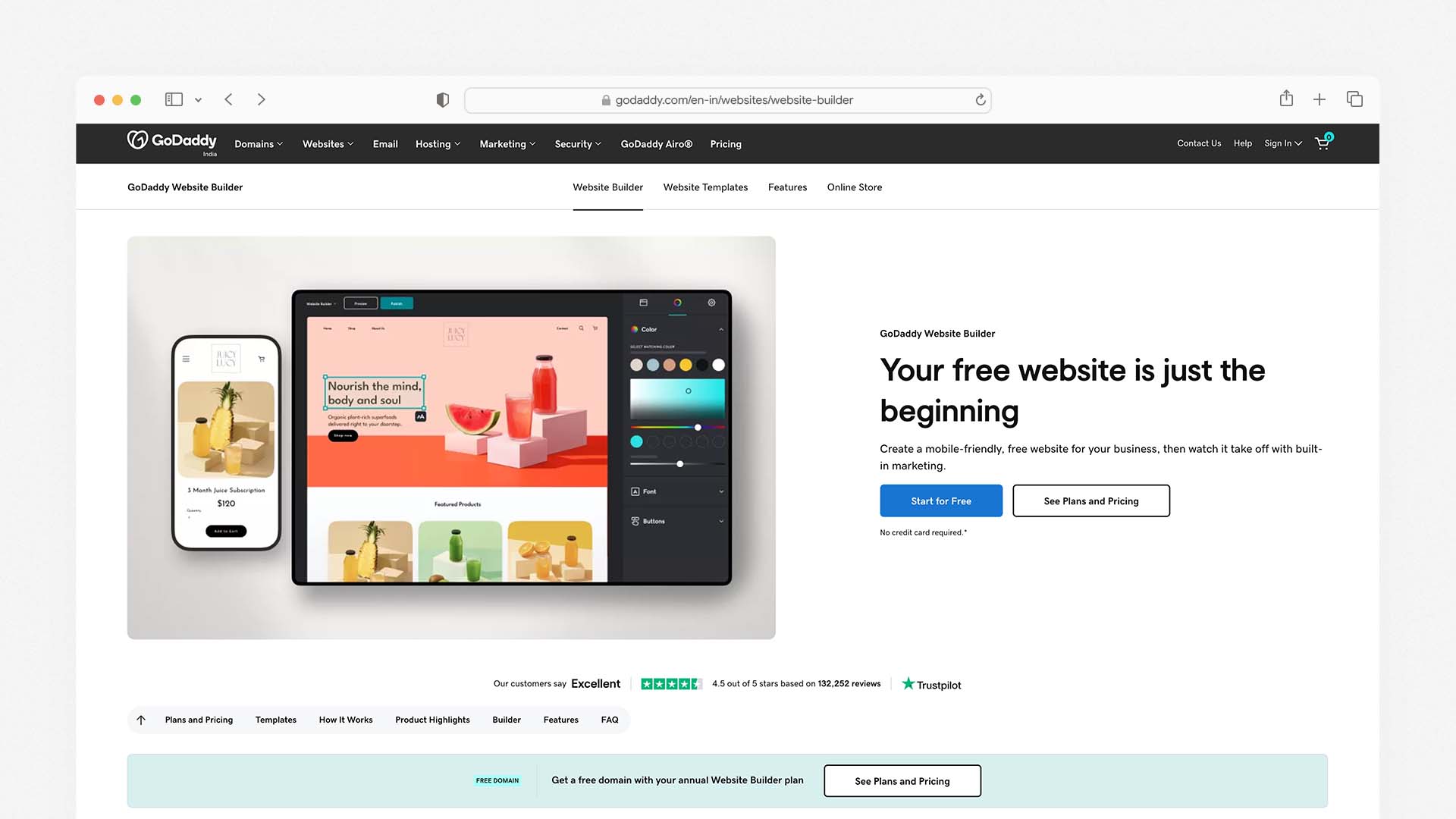
GoDaddy is the simplest builder on this list to get a mobile-ready website live, and for business owners who need to be online today without learning a complex editor, it delivers a professional mobile experience from the moment you publish.
IONOS MyWebsite Now has 40+ mobile-responsive templates that automatically adjust to desktops, tablets, and smartphones. GoDaddy takes a similar approach — templates are responsive by default, mobile layouts are generated automatically, and the setup wizard gets you from registration to published site in under an hour.
The GoDaddy Airo AI system generates a starting site — including a mobile-ready layout, a logo, and basic marketing copy — from your business name and description in a single session. For a local business owner who needs a professional online presence and a mobile-friendly design without spending time learning a builder, the speed of this setup is genuinely impressive.
GoDaddy's mobile management app allows you to update content, manage appointments, check analytics, and handle basic ecommerce from your phone. The app is more limited than Wix Owner or Squarespace's app in terms of design editing, but covers the day-to-day management tasks that most small businesses need.
The limitation for mobile is customisation depth. GoDaddy does not offer a separate mobile editor — the mobile layout is automatically generated from your desktop design, with less manual control over the mobile-specific experience than Wix or Hostinger provide. For businesses that need their mobile design to feel truly tailored to phone users, the lack of independent mobile editing is a constraint.
GoDaddy Pros for Mobile:
Fastest setup — mobile-ready site live in under an hour
Airo AI generates a complete mobile-friendly site from a description
GoDaddy app for mobile management on iOS and Android
Click-to-call buttons available on all plans
Domain, hosting, SSL, and email all in one account
27 construction and business-specific mobile-responsive templates
GoDaddy Cons for Mobile:
No separate mobile editor — less control over mobile-specific layout
Renewal prices increase significantly — check before committing
Mobile Core Web Vitals scores moderate compared to Hostinger
Basic SEO tools — not ideal for mobile SEO optimisation
GoDaddy Pricing:
Plan | Monthly Price | Key Mobile Feature |
|---|---|---|
Basic | $9.99/month | Auto-responsive templates, mobile app |
Standard | $14.99/month | Email marketing, social tools |
Premium | $20.99/month | Advanced marketing |
Commerce | $23.99/month | Mobile-friendly checkout |
Best for: Local service businesses that need to be mobile-ready today without any learning curve, and where speed of launch matters more than precise mobile design control.
6. Webflow — Best for Advanced Mobile Design Quality
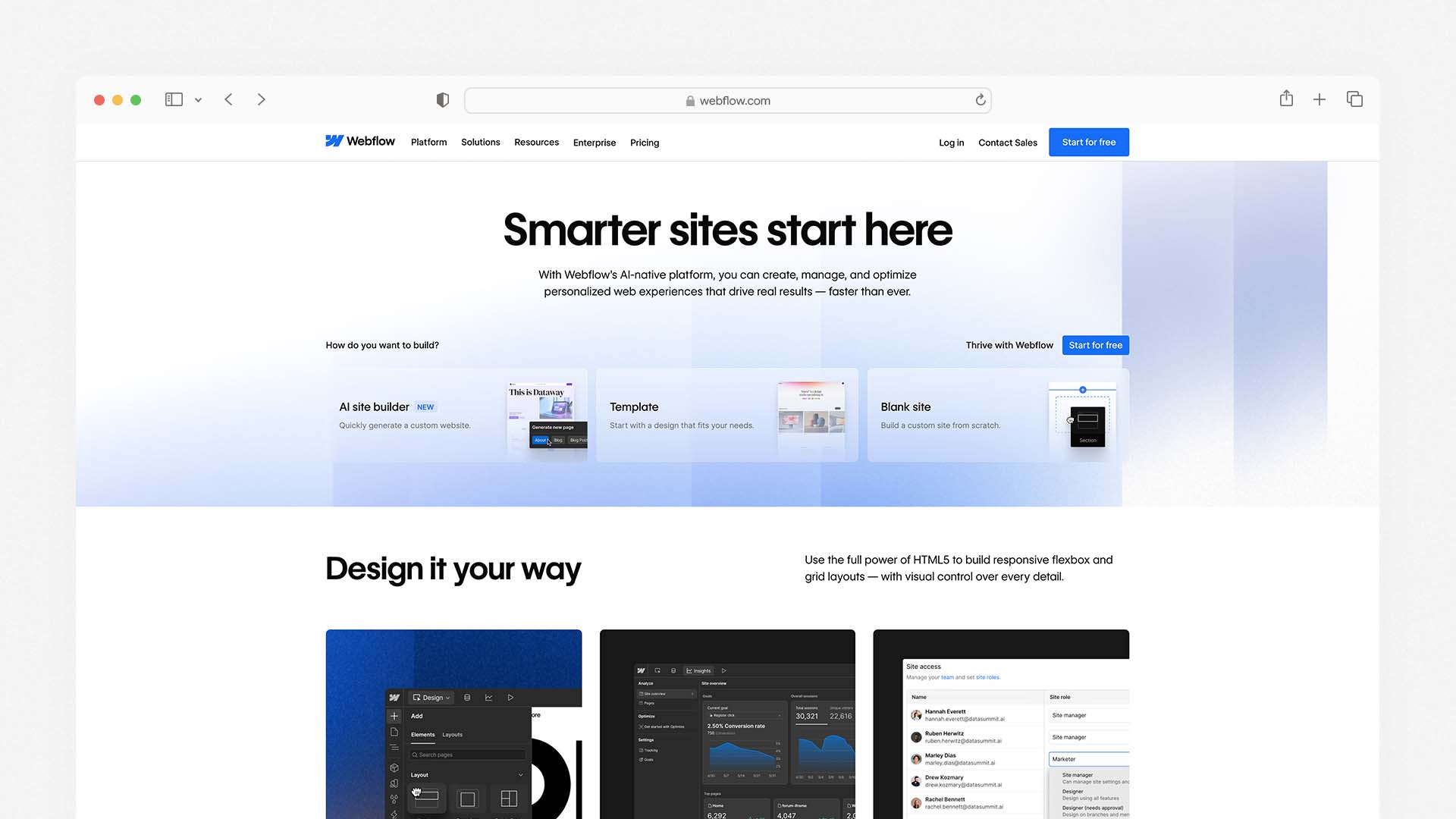
Webflow gives professional designers and developers the most precise mobile design control of any builder on this list. Its breakpoint system lets you independently define layouts, typography, spacing, and animations for five distinct screen sizes: desktop (1920px), laptop (1280px), tablet (768px), mobile landscape (480px), and mobile portrait (390px). Every element on every page can be controlled independently at every breakpoint.
If you want a simpler platform without advanced design tools, see our guide to the Best DIY Website Builders.
In 2026, mobile-first web design is not just a trend — it is essential for any brand wanting to thrive online. Webflow is the most capable tool for implementing genuine mobile-first design without writing raw CSS, producing mobile experiences that are measurably better in Core Web Vitals performance than most template-based builders — because the output is clean, semantic HTML and CSS rather than the heavier JavaScript-dependent rendering that Wix and Squarespace use.
The trade-off is the learning curve. Webflow is not beginner-friendly. The interface assumes familiarity with concepts like the box model, flexbox, and CSS positioning — the same concepts that underpin web development. Users without design or development backgrounds consistently find Webflow's editor intimidating, and the CMS setup required before publishing content is more involved than any other platform on this list.
Webflow also has no mobile management app, which is a practical limitation for site owners who need to update content from their phones.
Webflow Pros for Mobile:
Most precise breakpoint control of any builder — five independent screen sizes
Clean semantic HTML output — the best Core Web Vitals performance of hosted builders
Full CSS and JavaScript access for complex mobile interactions
CMS collections generate mobile-optimised content pages automatically
Strong SEO tools including schema markup for mobile search
Webflow Cons for Mobile:
No mobile management app — desktop-only administration
Steep learning curve — not suitable for beginners
CMS setup required before publishing
Higher cost for advanced plans with significant traffic
Webflow Pricing:
Plan | Monthly Price | Key Mobile Feature |
|---|---|---|
Free | $0 | Mobile preview, Webflow subdomain |
Basic | $14/month | Custom domain, full breakpoint control |
CMS | $23/month | 2,000 CMS items, content editor |
Business | $39/month | 10,000 CMS items, advanced analytics |
Best for: Professional web designers, agencies, and technically-minded users who need the highest level of mobile layout control and are comfortable with a design-tool learning curve.
7. Shopify — Best Mobile Builder for Ecommerce

For businesses whose mobile website is primarily a store, Shopify is the strongest option on this list. Shopify is great for managing online stores on the go. Its mobile commerce experience is arguably the most refined of any ecommerce platform — with a checkout flow specifically designed for phone users, mobile-optimised product pages, and a management app that gives merchants full operational control from a smartphone.
Every Shopify theme is mobile-responsive by default. The product detail pages, collection pages, cart, and checkout are all optimised for small screens and touch interaction. The checkout in particular — Shopify's proprietary Shop Pay system — is trusted by hundreds of millions of customers and achieves some of the highest mobile conversion rates in the ecommerce industry.
The Shopify app (iOS and Android) is the most full-featured ecommerce management app of any platform on this list. From your phone you can manage your full product catalogue, process orders, handle customer service, run discount campaigns, check detailed sales analytics, manage inventory, and even run your physical POS system. For a merchant who manages their business primarily from a phone, Shopify's mobile operations capability is unmatched.
The limitation is that Shopify is designed for stores, not general websites. Blog functionality is limited, marketing pages are less flexible than Wix or Squarespace, and at $29/month for the basic selling plan, it is the most expensive entry point on this list for general site building.
Shopify Pros for Mobile:
The best mobile ecommerce experience of any builder — checkout, product pages, cart all phone-optimised
Shopify app gives full store management from a phone — the most capable ecommerce app tested
Shop Pay checkout trusted by hundreds of millions of mobile shoppers
Sell across website, Instagram, TikTok, and in-person from one mobile dashboard
PCI-DSS compliant mobile payments on all plans
Shopify Cons for Mobile:
Higher starting price — $29/month for the full store
Not designed for general websites — limited marketing and content page flexibility
Domain not included — purchased separately
Shopify Payments not available in all countries
Shopify Pricing:
Plan | Monthly Price | Key Mobile Feature |
|---|---|---|
Starter | $5/month | Social selling only, no full website |
Basic | $29/month | Full mobile store, Shopify app |
Shopify | $79/month | Advanced mobile analytics |
Advanced | $299/month | Enterprise mobile commerce |
Best for: Online retailers, product businesses, and anyone whose mobile website is primarily a store where the mobile checkout experience directly affects revenue.
8. SITE123 — Best Free Mobile Website Builder
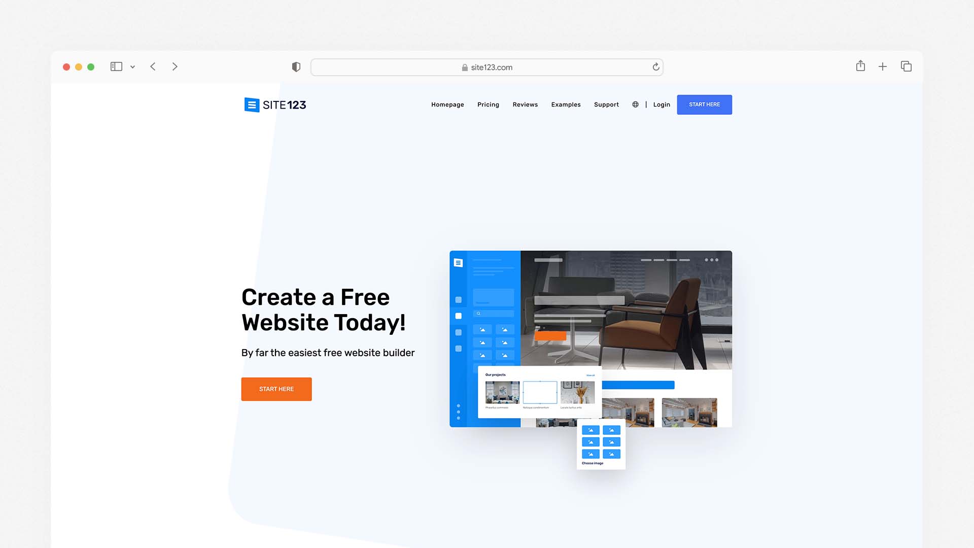
SITE123 is a beginner-oriented website builder that emphasises speed and simplicity while ensuring mobile responsiveness. Its templates automatically adapt to smartphones, tablets, and desktops, and you can preview different device views directly in the editor. Because its editor is section-based rather than freeform drag-and-drop, design freedom is more constrained — but this also helps reduce decision paralysis for mobile-first users.
SITE123's primary advantage is its free plan. You can build and publish a mobile-responsive website at no cost on a SITE123 subdomain, with no time limit. All templates are mobile-responsive by default, the setup wizard gets a first-time user to a published mobile-friendly page in under 15 minutes, and the overall experience requires essentially no technical knowledge.
The trade-offs are real: design customisation is limited, there is no separate mobile editor, the free plan shows SITE123 branding, and advanced features including ecommerce and custom domains require a paid plan starting at $12.80 per month. For users who need a permanent, fully customised mobile website, the paid builders on this list offer significantly better value. But for testing a concept, setting up a temporary landing page, or building a simple personal site at zero cost, SITE123 is the most accessible free option with guaranteed mobile responsiveness.
SITE123 Pros for Mobile:
Free plan with no time limit — build a mobile-responsive site at zero cost
All templates mobile-responsive by default — no manual adjustment needed
Fastest setup of any builder on this list — published in under 15 minutes
Device preview shows exactly how the site looks on phone, tablet, and desktop
Section-based editor prevents common mobile layout mistakes
SITE123 Cons for Mobile:
No separate mobile editor — limited mobile-specific customisation
Free plan shows SITE123 branding and subdomain
Less design flexibility than Wix, Squarespace, or Webflow
Limited scalability for growing businesses
SITE123 Pricing:
Plan | Monthly Price | Key Mobile Feature |
|---|---|---|
Free | $0 | Mobile-responsive site on SITE123 subdomain |
Platinum | $12.80/month | Custom domain, remove branding, ecommerce |
Best for: Beginners who need a free mobile-friendly website immediately with zero setup complexity — and who do not yet need a custom domain or advanced features.
Which Mobile Website Builder Should You Choose?
Your Situation | Best Choice |
|---|---|
You want the most hands-on mobile layout control | Wix |
You want the best-looking mobile templates with minimal effort | Squarespace |
You want the fastest mobile load times | Hostinger |
You are an agency needing advanced breakpoint control | Wix Studio |
You need to launch a mobile-ready site today with no learning curve | GoDaddy |
You want pixel-perfect mobile design control | Webflow |
Your mobile website is primarily a store | Shopify |
You want a free mobile website with zero setup | SITE123 |
How Google Judges Your Mobile Website — And What to Do About It
Google's mobile-first indexing means the mobile version of your site is the version Google uses to determine your ranking — for every search result, on every device. Understanding what Google measures and how to improve it is the most actionable thing you can do to improve your search traffic after choosing a platform.
Core Web Vitals — The Three Scores That Affect Your Ranking
Largest Contentful Paint (LCP): How quickly the largest visible element on the page — usually a hero image or headline — loads on a mobile device. Google's threshold for a "good" score is under 2.5 seconds. Sites scoring above 4 seconds are flagged as "poor." The primary fix is optimising image sizes and formats for mobile — use WebP format images sized at the actual dimensions they appear on a phone, not desktop dimensions scaled down.
Cumulative Layout Shift (CLS): How much the page layout jumps around as it loads — elements appearing and pushing other elements out of position. On mobile, a high CLS score makes a page feel broken and untrustworthy. The fix is to always set explicit dimensions on images and embedded content so the browser reserves space for them before they load.
Interaction to Next Paint (INP): How quickly the page responds when a user taps a button, link, or form element. Pages that feel sluggish to respond on a phone score poorly here. Reducing JavaScript payload and deferring non-essential scripts improves INP on any platform.
All eight builders on this list generate sites that can achieve good Core Web Vitals scores — but the starting point varies significantly. Hostinger and Webflow consistently produce the cleanest output. Wix and Squarespace require attention to image optimisation to score well. GoDaddy and SITE123 are middle of the pack.
Hosting infrastructure also plays a major role in mobile performance. This guide explains what cloud hosting is and why it affects page speed.
Google Search Console Mobile Usability Report
Google Search Console is free, and its Mobile Usability report tells you exactly which pages on your site have mobile issues detected by Google's crawler — text too small to read, clickable elements too close together, content wider than the screen. Submit your sitemap through Search Console when you launch, check the Mobile Usability report weekly for the first month, and fix every issue flagged. This alone can produce measurable improvements in mobile search rankings within weeks of corrections being made.
Mobile Page Speed Test
Google's PageSpeed Insights tool (free at pagespeed.web.dev) gives you a real Core Web Vitals score for any URL, tested on a simulated mobile connection. Run every key page on your site through this tool before you launch — your home page, your services page, your contact page, your most important blog post. The tool tells you exactly what is slowing each page down and prioritises fixes by impact.
Mobile SEO — Five Things That Affect Your Rankings on Phones
Use a Mobile-Friendly URL Structure
Keep your URLs short, descriptive, and free of unnecessary parameters. A URL like yoursite.com/plumber-london is better than yoursite.com/page?id=247&category=services on every device, but particularly on mobile where long URLs are hard to read and share. Every builder on this list lets you set custom URL slugs — use them.
Put Your Most Important Content Above the Fold
On a phone, "above the fold" means within the first 600 pixels of screen height — what a visitor sees before they scroll. Your business name, what you do, your location (if relevant), and a clear call to action should all be visible without scrolling. This is partly a design choice and partly a mobile template choice — templates that bury the call to action below a full-screen image underperform significantly on mobile.
Make Every Phone Number a Tap-to-Call Link
On mobile, a phone number that a user has to manually type is a phone number most users will not call. Every phone number on your website should be wrapped in a tel: link — <a href="tel:+447911123456">07911 123456</a> — so mobile visitors can call you with a single tap. Most website builders handle this automatically when you add a phone number through their phone number element; check that it is enabled.
Optimise Images for Mobile Screen Sizes
The single largest cause of slow mobile websites is images sized for desktop screens being served to phones. A hero image that looks sharp at 1920px wide takes 5–10x longer to load than the same image correctly sized at 800px for a mobile device. Use your builder's image compression tools, serve WebP format where possible, and — if your builder allows it — serve different image sizes for desktop and mobile using responsive image markup.
Test on Real Devices — Not Just Browser Preview Modes
Browser preview modes simulate a phone screen but do not replicate the actual performance characteristics of a mobile browser on a real device — particularly on a 4G connection with limited processing power. Before you launch, test your site on at least two real devices: an Android phone and an iPhone. Check every page, fill out every form, and tap every button. The issues that matter to real visitors on real phones are often invisible in a desktop preview.
Final Verdict
Every builder on this list produces a mobile-responsive website. The differences that matter are how much control you have over the mobile experience, how fast the pages load on a real phone, how easy it is to manage your site from a phone, and how well the templates are designed for small screens from the start:
For a broader comparison of website platforms beyond mobile performance, start with our guide to the Best Website Builder and Hosting for Small Business.
Choose Wix for the most complete mobile control — separate editor, management app, and AI optimisation in one platform
Choose Squarespace for the most beautiful mobile templates with zero manual adjustment required
Choose Hostinger for the fastest mobile load times at the lowest monthly cost
Choose Wix Studio if you are an agency or advanced user needing true breakpoint-level responsive control
Choose GoDaddy for the fastest route to a mobile-ready site with no learning curve
Choose Webflow for pixel-perfect mobile design control and the cleanest Core Web Vitals output
Choose Shopify if your mobile website is primarily an online store
Choose SITE123 for a free mobile-responsive website with zero setup complexity
The most important step is to test your finished site on a real phone before you publish it. Whatever platform you choose, what a visitor experiences on their device is what determines whether they stay or leave — and that is always worth checking on the actual hardware your visitors use.
The best mobile website builder for most people is Wix — it gives you a dedicated mobile editor where you can design your phone experience independently from your desktop site, has a full-featured mobile app for managing your site on the go, and its AI system automatically optimises layouts for every screen size. For the most consistently polished mobile templates with zero configuration, Squarespace is the stronger choice — every template is designed mobile-first and looks exceptional on a phone without any manual adjustment. For speed, budget, and the fastest mobile load times tested, Hostinger starts at $2.99 per month and outperforms both Wix and Squarespace on Google's Core Web Vitals mobile scores.
We tested eight website builders specifically for mobile — using real Android and iOS devices, not just desktop preview modes. We checked template responsiveness, mobile editing apps, touch interaction quality, load times on 4G connections, and how each platform handles Google's mobile-first indexing. Here is what we found.
If you're comparing platforms more broadly, see our guide to the Best Website Builder and Hosting for Small Business.
Why Mobile Optimisation Is Now Your Most Important Website Decision
Over 60% of web traffic comes from mobile devices. That is not a prediction — it is the current reality. More than half the people who will ever visit your website will do so on a phone, in a browser window roughly 390 pixels wide, with a thumb instead of a mouse and a 4G connection instead of fibre broadband.
Since 2020, Google has used mobile-first indexing, meaning your website's mobile version is the primary one that determines your ranking in search results. Your rank will drop on all devices — including desktop — if your mobile site is slow, broken, or hard to use.
According to Google Consumer Insights, if a website takes more than three seconds to load, more than half of mobile users will leave the page. That 53% abandonment rate is not a minor inconvenience — it is a direct hit to every business metric your website is supposed to improve.
The implication is clear: choosing a website builder that handles mobile well is no longer optional. It is the primary technical decision affecting your ability to rank on Google, retain visitors, and convert them into customers.
Many modern builders now include artificial intelligence features to optimise layouts automatically. Our guide to the Best AI Website Builders explains how these tools work.
Responsive vs Mobile-First — The Distinction That Matters
Most website builders claim to be "mobile-friendly." That term covers a wide range of quality, and understanding the difference matters before you choose a platform.
Responsive design means your website scales and rearranges itself automatically to fit any screen size. This is the baseline. Every builder on this list does it. But responsive alone does not guarantee a good mobile experience — it just means the site does not break on a phone. Elements that look great at 1440px wide can still feel cramped, mis-sized, or awkward at 390px, even on a responsive site.
Mobile-first design means the mobile experience was the primary design consideration — the site was built for a small screen and then scaled up to desktop, rather than the other way around. Mobile-first sites tend to have faster load times, cleaner layouts on phones, and touch interactions that feel natural rather than transplanted from a mouse-driven interface.
In 2026, shrinking a desktop site to fit on a mobile device is no longer enough — mobile-first design is now the standard for any brand wanting to perform well online.
When evaluating each builder below, we have specifically noted which ones offer true mobile-first design control and which ones offer responsiveness that you then manually adjust.
What to Look for in a Mobile Website Builder
Separate Mobile Editor
The best builders give you independent control over your mobile layout — the ability to rearrange sections, hide elements that do not work on small screens, resize text and images specifically for mobile, and preview exactly what visitors on a phone will see. This level of control produces significantly better mobile experiences than builders that only let you adjust the shared desktop-mobile template.
Mobile Management App
If you run a business, you will want to update your website, check analytics, respond to enquiries, and manage orders from your phone — not just build the site from your desktop. A strong mobile management app is a genuine practical advantage for any business owner who is not always at a computer.
Core Web Vitals Performance
Google scores every website on three Core Web Vitals metrics: Largest Contentful Paint (how fast the main content loads), Cumulative Layout Shift (how stable the layout is as it loads), and Interaction to Next Paint (how quickly the site responds to touch). These scores directly affect your Google rankings. We checked real Core Web Vitals scores for each platform below.
Touch-Optimised Interactions
Navigation menus, buttons, and form fields designed for a mouse cursor often create friction on a touchscreen. Tap targets that are too small, buttons too close together, and forms that do not trigger the correct mobile keyboard — these are real usability problems that turn visitors away before they convert. The best mobile builders handle all of this automatically.
Mobile-First Templates
Templates that are designed starting from the mobile view — with font sizes, spacing, and image crops chosen for a 390px screen — look noticeably better on phones than templates adapted from a desktop layout. We noted which platforms lead here.
Quick Comparison — Best Mobile Website Builders
Builder | Mobile Editor | Management App | Core Web Vitals | Mobile-First Templates | Starting Price |
|---|---|---|---|---|---|
Wix | ✅ Separate mobile editor | ✅ iOS + Android | Good | ✅ Yes | $17/month |
Squarespace | ⚠️ Shared editor, device preview | ✅ iOS + Android | Good | ✅ Best-in-class | $16/month |
Hostinger | ✅ Separate mobile controls | ✅ iOS + Android | ✅ Best tested | ✅ Yes | $2.99/month |
Wix Studio | ✅ True responsive breakpoints | ✅ iOS + Android | Good | ✅ Advanced | $17/month |
GoDaddy | ⚠️ Auto-responsive | ✅ iOS + Android | Moderate | ✅ Yes | $9.99/month |
Webflow | ✅ Full breakpoint control | ❌ No app | ✅ Excellent | ✅ Yes | $14/month |
Shopify | ⚠️ Auto-responsive | ✅ iOS + Android | Good | ✅ Yes | $29/month |
SITE123 | ⚠️ Auto-responsive | ❌ Limited | Moderate | ✅ Yes | Free / $12.80/month |
The 8 Best Mobile Website Builders — Full Reviews
1. Wix — Best Overall Mobile Website Builder
Wix is the best all-around mobile website builder because it combines the most granular mobile editing controls of any hosted builder with a full-featured management app, strong Core Web Vitals performance, and an AI system — Wix Harmony — that adjusts layouts, font sizes, and section spacing for mobile automatically when you make desktop changes.
Wix also ranks as the best overall platform in our comparison of the Best AI Website Builders.
The defining feature for mobile is Wix's separate mobile editor. When you switch to mobile view in the Wix editor, you are not just previewing your desktop design scaled down — you are editing a distinct mobile layout. You can hide sections that do not translate well to a small screen, rearrange the order of content blocks, resize images, adjust text sizes independently, and add mobile-only elements like a sticky click-to-call button. This control is genuinely rare among hosted builders and produces mobile experiences that feel purpose-built for phones rather than adapted from a desktop design.
Wix gives you full creative control over your mobile design, including 2,500+ templates and a powerful drag-and-drop mobile editor. The mobile editor also includes a dedicated mobile menu designer where you can configure how your navigation appears on small screens — choosing between a hamburger menu, a tab bar at the bottom of the screen, or a full-screen overlay navigation.
The Wix Owner app (available for iOS and Android) is one of the strongest mobile management apps on this list. From your phone you can publish new pages, write and schedule blog posts, update product listings, view real-time analytics, respond to customer messages, manage bookings, and process orders. For a business owner who needs to manage their website between client meetings and site visits, this level of mobile management access is genuinely practical.
For Wix Studio — Wix's professional-tier builder for agencies and advanced users — the mobile experience adds true responsive breakpoints: you can set specific layouts for desktop, tablet, and mobile independently, with pixel-level control over how each element behaves at each screen width. This is the closest a no-code builder gets to how professional developers implement responsive design. Wix Studio includes responsive AI to aid in adjustments for smaller screens, integrated collaboration tools for team projects, and high-level design controls.
Wix Pros for Mobile:
Separate mobile editor — design your phone experience independently from desktop
Hide, reorder, and resize any element specifically for mobile
Dedicated mobile navigation designer for hamburger menus and tab bars
Wix Owner app lets you fully manage your site from a phone
Wix Harmony AI adjusts mobile layouts automatically as you build
Mobile sticky buttons (click-to-call, WhatsApp) available without plugins
2,500+ templates, all mobile-responsive out of the box
Wix Cons for Mobile:
Mobile editor is separate — changes do not always sync intelligently between desktop and mobile views
Free plan shows Wix branding on mobile
Cannot switch templates after publishing — mobile layout is tied to your template choice
Wix Pricing:
Plan | Monthly Price | Key Mobile Feature |
|---|---|---|
Free | $0 | Mobile site on Wix subdomain |
Light | $17/month | Custom domain, mobile editor, Owner app |
Core | $29/month | Accept payments, full analytics |
Business | $36/month | Advanced ecommerce |
Best for: Small businesses, service providers, and anyone who wants the most hands-on control over their mobile layout and needs to manage their site from a phone regularly.
2. Squarespace — Best for Mobile Template Quality
Squarespace produces the most consistently beautiful mobile websites of any builder on this list. Squarespace has made a name for itself with its clean, contemporary, and gorgeous mobile-friendly templates — designed to suit a variety of content types including blogs, ecommerce, and small business websites. The designs are mobile-optimised, with content and elements automatically adjusted according to the size of the visitor's browser.
What makes Squarespace's mobile quality exceptional is that its templates are genuinely designed mobile-first by professional designers — not adapted from desktop layouts. Typography choices, image cropping ratios, spacing between elements, and navigation patterns are all considered from a phone-first perspective. The result is that a Squarespace site on a mobile phone consistently looks more intentional and polished than comparable templates on Wix or GoDaddy, with less manual adjustment required to achieve a professional result.
Squarespace enables AMP (Accelerated Mobile Pages) by default on blog posts. The AMP integration creates a lightweight version of your pages to help them load faster on mobile devices. This is a meaningful performance advantage for content-heavy sites, particularly blogs and news-style publications where fast mobile loading directly affects both user experience and Google rankings.
The Squarespace app (iOS and Android) lets you manage your site from a phone with most of the key functions available: editing page content, managing products, processing orders, viewing analytics, and responding to form submissions. The full design editor is desktop-only — you cannot redesign your layout from the app — but day-to-day site management from a phone is well-covered.
Squarespace has a Device View tool to show what your site looks like on a mobile device, and lets you edit desktop and mobile versions simultaneously. The trade-off compared to Wix is that you cannot independently rearrange the mobile layout the way Wix's separate mobile editor allows — what you see in mobile view is a responsive interpretation of your desktop design rather than a fully independent mobile layout.
Squarespace Pros for Mobile:
The most polished and professionally designed mobile templates of any builder tested
AMP enabled by default on blog posts for faster mobile loading
Blueprint AI generates a mobile-optimised starting site in under 10 minutes
Device View tool previews mobile appearance in real time during editing
Squarespace app covers all key site management tasks from a phone
Unlimited bandwidth and storage on all plans — no mobile performance throttling
No separate mobile layout needed — templates work beautifully on phones from day one
Squarespace Cons for Mobile:
Cannot independently rearrange mobile layout — less control than Wix's separate editor
Page load speeds average 2.2 seconds — slightly slower than Hostinger
No free plan — 14-day trial only
2% transaction fee on Basic plan
Squarespace Pricing:
Plan | Monthly Price | Key Mobile Feature |
|---|---|---|
Basic | $16/month | Mobile-optimised templates, AMP, Squarespace app |
Core | $23/month | No transaction fees, digital products |
Plus | $39/month | Advanced analytics |
Advanced | $99/month | Full ecommerce suite |
Best for: Creative professionals, service businesses, and brand-conscious owners who want the best-looking mobile website with minimal adjustment — and who prioritise visual quality over layout control.
3. Hostinger — Best for Mobile Load Speed
Hostinger consistently outperforms every other hosted builder on this list on the metrics that matter most for mobile: page load time and Core Web Vitals scores. In independent testing, Hostinger-hosted sites average a Time to First Byte (TTFB) of approximately 0.19 seconds — significantly faster than Wix (around 0.6 seconds) and Squarespace (around 0.8 seconds). For mobile users on 4G connections where every millisecond of load time affects the likelihood of staying on the page, this speed advantage is meaningful.
We also analysed Hostinger in our guide to the Best Website Builder and Hosting for Small Business, where it ranks as the best budget option.
All Hostinger Website Builder sites are automatically responsive, so you need to build one version and let the smart technology handle mobile adaptation. Changes applied to the desktop site version are not applied to the mobile version, meaning you have full design freedom to create a mobile view that is completely functional and professional-looking. There is a comprehensive system for sorting, resizing, and changing various mobile-only elements.
Hostinger Website Builder supports users with mobile-first capabilities, letting you adjust the mobile version of your site independently for better visual consistency across devices. With 150+ mobile-optimised templates and fast-loading website infrastructure, Hostinger ensures sites look good and load efficiently on any screen size.
The Hostinger AI Website Builder generates a complete mobile-optimised site from a text description in under 60 seconds. The AI produces layouts that are genuinely designed for small screens — with appropriate font sizes, touch-friendly spacing, and section ordering that works on a phone — rather than desktop layouts that happen to scale down.
The Hostinger mobile app (iOS and Android) gives you access to site analytics, basic content editing, and blog post management from your phone. It is less fully featured than the Wix Owner app or Squarespace's app — design editing and ecommerce management are primarily desktop-based — but covers the monitoring and basic content tasks that most site owners need on the go.
At $2.99 per month for the Premium plan, Hostinger is the most affordable builder on this list that still delivers genuinely strong mobile performance. The price can be locked in for up to 48 months, eliminating the renewal price anxiety that affects IONOS and GoDaddy.
Hostinger Pros for Mobile:
The fastest mobile load times of any hosted builder tested (TTFB 0.19s)
Best Core Web Vitals scores consistently across tested sites
Independent mobile controls — adjust mobile layout separately from desktop
AI generates mobile-optimised layouts from a text description in 60 seconds
150+ mobile-optimised templates across all industries
Starts at $2.99/month — best mobile performance per pound/dollar on the market
Price lockable for 48 months — no renewal surprises
Hostinger Cons for Mobile:
Mobile management app less full-featured than Wix or Squarespace
Template designs less visually polished than Squarespace
No built-in email marketing or CRM
eCommerce requires Business plan at $3.99/month
Hostinger Pricing:
Plan | Monthly Price (48-mo) | Key Mobile Feature |
|---|---|---|
Premium | $2.99/month | AI builder, independent mobile editor, 25 websites |
Business | $3.99/month | eCommerce, Kodee AI, faster NVMe storage |
Cloud Startup | $7.99/month | Daily backups, dedicated IP, CDN |
Best for: Small businesses, freelancers, and budget-conscious users who want the fastest mobile load times available from a hosted builder — especially those targeting mobile-heavy audiences.
4. Wix Studio — Best for Agencies and Advanced Mobile Control
Wix Studio is Wix's professional-tier builder, designed for agencies, freelancers, and advanced users who need the kind of responsive control that traditionally required writing CSS media queries by hand. Wix Studio is built to offer true responsiveness and sophisticated design control for agencies and web designers, with responsive AI to aid in adjustments for smaller screens and high-level design controls. You don't need coding skills, but if you're feeling adventurous, the source code is available to tweak.
The key difference from standard Wix is breakpoint control. Wix Studio lets you set specific layouts for desktop (1440px+), tablet (768px), and mobile (390px) screen widths independently. You can define exactly how each element — its size, position, padding, and visibility — behaves at each breakpoint. This is the closest any no-code builder comes to how professional web developers implement responsive design, and it produces mobile experiences that are noticeably more precise than what standard responsive templates achieve automatically.
Wix Studio also includes a CSS Grid system for layout control, the ability to write custom CSS for any element, and a full JavaScript API for adding custom interactions and animations. For agencies building mobile websites for clients who need both ease of management and professional-grade mobile design quality, Wix Studio is the most capable no-code option on this list.
Wix Studio Pros for Mobile:
True breakpoint control — independent layouts for desktop, tablet, and mobile
CSS Grid layout system for precise mobile positioning
Responsive AI suggests optimal layouts for each screen size
Custom CSS and JavaScript for advanced mobile interactions
Full white-label capabilities for client delivery
All standard Wix mobile features included (Owner app, mobile editor)
Wix Studio Cons for Mobile:
Steeper learning curve than standard Wix — not beginner-friendly
Designed for agency/professional use — overkill for simple personal sites
Fewer pre-built templates than standard Wix
Wix Studio Pricing:
Plan | Monthly Price | Key Mobile Feature |
|---|---|---|
Basic | $17/month | Responsive breakpoints, custom CSS |
Core | $29/month | Ecommerce, advanced analytics |
Business | $36/month | Priority support |
Best for: Web designers, agencies, and advanced users who need pixel-level mobile layout control across breakpoints without writing code from scratch.
5. GoDaddy — Best for the Fastest Mobile Launch
GoDaddy is the simplest builder on this list to get a mobile-ready website live, and for business owners who need to be online today without learning a complex editor, it delivers a professional mobile experience from the moment you publish.
IONOS MyWebsite Now has 40+ mobile-responsive templates that automatically adjust to desktops, tablets, and smartphones. GoDaddy takes a similar approach — templates are responsive by default, mobile layouts are generated automatically, and the setup wizard gets you from registration to published site in under an hour.
The GoDaddy Airo AI system generates a starting site — including a mobile-ready layout, a logo, and basic marketing copy — from your business name and description in a single session. For a local business owner who needs a professional online presence and a mobile-friendly design without spending time learning a builder, the speed of this setup is genuinely impressive.
GoDaddy's mobile management app allows you to update content, manage appointments, check analytics, and handle basic ecommerce from your phone. The app is more limited than Wix Owner or Squarespace's app in terms of design editing, but covers the day-to-day management tasks that most small businesses need.
The limitation for mobile is customisation depth. GoDaddy does not offer a separate mobile editor — the mobile layout is automatically generated from your desktop design, with less manual control over the mobile-specific experience than Wix or Hostinger provide. For businesses that need their mobile design to feel truly tailored to phone users, the lack of independent mobile editing is a constraint.
GoDaddy Pros for Mobile:
Fastest setup — mobile-ready site live in under an hour
Airo AI generates a complete mobile-friendly site from a description
GoDaddy app for mobile management on iOS and Android
Click-to-call buttons available on all plans
Domain, hosting, SSL, and email all in one account
27 construction and business-specific mobile-responsive templates
GoDaddy Cons for Mobile:
No separate mobile editor — less control over mobile-specific layout
Renewal prices increase significantly — check before committing
Mobile Core Web Vitals scores moderate compared to Hostinger
Basic SEO tools — not ideal for mobile SEO optimisation
GoDaddy Pricing:
Plan | Monthly Price | Key Mobile Feature |
|---|---|---|
Basic | $9.99/month | Auto-responsive templates, mobile app |
Standard | $14.99/month | Email marketing, social tools |
Premium | $20.99/month | Advanced marketing |
Commerce | $23.99/month | Mobile-friendly checkout |
Best for: Local service businesses that need to be mobile-ready today without any learning curve, and where speed of launch matters more than precise mobile design control.
6. Webflow — Best for Advanced Mobile Design Quality
Webflow gives professional designers and developers the most precise mobile design control of any builder on this list. Its breakpoint system lets you independently define layouts, typography, spacing, and animations for five distinct screen sizes: desktop (1920px), laptop (1280px), tablet (768px), mobile landscape (480px), and mobile portrait (390px). Every element on every page can be controlled independently at every breakpoint.
If you want a simpler platform without advanced design tools, see our guide to the Best DIY Website Builders.
In 2026, mobile-first web design is not just a trend — it is essential for any brand wanting to thrive online. Webflow is the most capable tool for implementing genuine mobile-first design without writing raw CSS, producing mobile experiences that are measurably better in Core Web Vitals performance than most template-based builders — because the output is clean, semantic HTML and CSS rather than the heavier JavaScript-dependent rendering that Wix and Squarespace use.
The trade-off is the learning curve. Webflow is not beginner-friendly. The interface assumes familiarity with concepts like the box model, flexbox, and CSS positioning — the same concepts that underpin web development. Users without design or development backgrounds consistently find Webflow's editor intimidating, and the CMS setup required before publishing content is more involved than any other platform on this list.
Webflow also has no mobile management app, which is a practical limitation for site owners who need to update content from their phones.
Webflow Pros for Mobile:
Most precise breakpoint control of any builder — five independent screen sizes
Clean semantic HTML output — the best Core Web Vitals performance of hosted builders
Full CSS and JavaScript access for complex mobile interactions
CMS collections generate mobile-optimised content pages automatically
Strong SEO tools including schema markup for mobile search
Webflow Cons for Mobile:
No mobile management app — desktop-only administration
Steep learning curve — not suitable for beginners
CMS setup required before publishing
Higher cost for advanced plans with significant traffic
Webflow Pricing:
Plan | Monthly Price | Key Mobile Feature |
|---|---|---|
Free | $0 | Mobile preview, Webflow subdomain |
Basic | $14/month | Custom domain, full breakpoint control |
CMS | $23/month | 2,000 CMS items, content editor |
Business | $39/month | 10,000 CMS items, advanced analytics |
Best for: Professional web designers, agencies, and technically-minded users who need the highest level of mobile layout control and are comfortable with a design-tool learning curve.
7. Shopify — Best Mobile Builder for Ecommerce
For businesses whose mobile website is primarily a store, Shopify is the strongest option on this list. Shopify is great for managing online stores on the go. Its mobile commerce experience is arguably the most refined of any ecommerce platform — with a checkout flow specifically designed for phone users, mobile-optimised product pages, and a management app that gives merchants full operational control from a smartphone.
Every Shopify theme is mobile-responsive by default. The product detail pages, collection pages, cart, and checkout are all optimised for small screens and touch interaction. The checkout in particular — Shopify's proprietary Shop Pay system — is trusted by hundreds of millions of customers and achieves some of the highest mobile conversion rates in the ecommerce industry.
The Shopify app (iOS and Android) is the most full-featured ecommerce management app of any platform on this list. From your phone you can manage your full product catalogue, process orders, handle customer service, run discount campaigns, check detailed sales analytics, manage inventory, and even run your physical POS system. For a merchant who manages their business primarily from a phone, Shopify's mobile operations capability is unmatched.
The limitation is that Shopify is designed for stores, not general websites. Blog functionality is limited, marketing pages are less flexible than Wix or Squarespace, and at $29/month for the basic selling plan, it is the most expensive entry point on this list for general site building.
Shopify Pros for Mobile:
The best mobile ecommerce experience of any builder — checkout, product pages, cart all phone-optimised
Shopify app gives full store management from a phone — the most capable ecommerce app tested
Shop Pay checkout trusted by hundreds of millions of mobile shoppers
Sell across website, Instagram, TikTok, and in-person from one mobile dashboard
PCI-DSS compliant mobile payments on all plans
Shopify Cons for Mobile:
Higher starting price — $29/month for the full store
Not designed for general websites — limited marketing and content page flexibility
Domain not included — purchased separately
Shopify Payments not available in all countries
Shopify Pricing:
Plan | Monthly Price | Key Mobile Feature |
|---|---|---|
Starter | $5/month | Social selling only, no full website |
Basic | $29/month | Full mobile store, Shopify app |
Shopify | $79/month | Advanced mobile analytics |
Advanced | $299/month | Enterprise mobile commerce |
Best for: Online retailers, product businesses, and anyone whose mobile website is primarily a store where the mobile checkout experience directly affects revenue.
8. SITE123 — Best Free Mobile Website Builder
SITE123 is a beginner-oriented website builder that emphasises speed and simplicity while ensuring mobile responsiveness. Its templates automatically adapt to smartphones, tablets, and desktops, and you can preview different device views directly in the editor. Because its editor is section-based rather than freeform drag-and-drop, design freedom is more constrained — but this also helps reduce decision paralysis for mobile-first users.
SITE123's primary advantage is its free plan. You can build and publish a mobile-responsive website at no cost on a SITE123 subdomain, with no time limit. All templates are mobile-responsive by default, the setup wizard gets a first-time user to a published mobile-friendly page in under 15 minutes, and the overall experience requires essentially no technical knowledge.
The trade-offs are real: design customisation is limited, there is no separate mobile editor, the free plan shows SITE123 branding, and advanced features including ecommerce and custom domains require a paid plan starting at $12.80 per month. For users who need a permanent, fully customised mobile website, the paid builders on this list offer significantly better value. But for testing a concept, setting up a temporary landing page, or building a simple personal site at zero cost, SITE123 is the most accessible free option with guaranteed mobile responsiveness.
SITE123 Pros for Mobile:
Free plan with no time limit — build a mobile-responsive site at zero cost
All templates mobile-responsive by default — no manual adjustment needed
Fastest setup of any builder on this list — published in under 15 minutes
Device preview shows exactly how the site looks on phone, tablet, and desktop
Section-based editor prevents common mobile layout mistakes
SITE123 Cons for Mobile:
No separate mobile editor — limited mobile-specific customisation
Free plan shows SITE123 branding and subdomain
Less design flexibility than Wix, Squarespace, or Webflow
Limited scalability for growing businesses
SITE123 Pricing:
Plan | Monthly Price | Key Mobile Feature |
|---|---|---|
Free | $0 | Mobile-responsive site on SITE123 subdomain |
Platinum | $12.80/month | Custom domain, remove branding, ecommerce |
Best for: Beginners who need a free mobile-friendly website immediately with zero setup complexity — and who do not yet need a custom domain or advanced features.
Which Mobile Website Builder Should You Choose?
Your Situation | Best Choice |
|---|---|
You want the most hands-on mobile layout control | Wix |
You want the best-looking mobile templates with minimal effort | Squarespace |
You want the fastest mobile load times | Hostinger |
You are an agency needing advanced breakpoint control | Wix Studio |
You need to launch a mobile-ready site today with no learning curve | GoDaddy |
You want pixel-perfect mobile design control | Webflow |
Your mobile website is primarily a store | Shopify |
You want a free mobile website with zero setup | SITE123 |
How Google Judges Your Mobile Website — And What to Do About It
Google's mobile-first indexing means the mobile version of your site is the version Google uses to determine your ranking — for every search result, on every device. Understanding what Google measures and how to improve it is the most actionable thing you can do to improve your search traffic after choosing a platform.
Core Web Vitals — The Three Scores That Affect Your Ranking
Largest Contentful Paint (LCP): How quickly the largest visible element on the page — usually a hero image or headline — loads on a mobile device. Google's threshold for a "good" score is under 2.5 seconds. Sites scoring above 4 seconds are flagged as "poor." The primary fix is optimising image sizes and formats for mobile — use WebP format images sized at the actual dimensions they appear on a phone, not desktop dimensions scaled down.
Cumulative Layout Shift (CLS): How much the page layout jumps around as it loads — elements appearing and pushing other elements out of position. On mobile, a high CLS score makes a page feel broken and untrustworthy. The fix is to always set explicit dimensions on images and embedded content so the browser reserves space for them before they load.
Interaction to Next Paint (INP): How quickly the page responds when a user taps a button, link, or form element. Pages that feel sluggish to respond on a phone score poorly here. Reducing JavaScript payload and deferring non-essential scripts improves INP on any platform.
All eight builders on this list generate sites that can achieve good Core Web Vitals scores — but the starting point varies significantly. Hostinger and Webflow consistently produce the cleanest output. Wix and Squarespace require attention to image optimisation to score well. GoDaddy and SITE123 are middle of the pack.
Hosting infrastructure also plays a major role in mobile performance. This guide explains what cloud hosting is and why it affects page speed.
Google Search Console Mobile Usability Report
Google Search Console is free, and its Mobile Usability report tells you exactly which pages on your site have mobile issues detected by Google's crawler — text too small to read, clickable elements too close together, content wider than the screen. Submit your sitemap through Search Console when you launch, check the Mobile Usability report weekly for the first month, and fix every issue flagged. This alone can produce measurable improvements in mobile search rankings within weeks of corrections being made.
Mobile Page Speed Test
Google's PageSpeed Insights tool (free at pagespeed.web.dev) gives you a real Core Web Vitals score for any URL, tested on a simulated mobile connection. Run every key page on your site through this tool before you launch — your home page, your services page, your contact page, your most important blog post. The tool tells you exactly what is slowing each page down and prioritises fixes by impact.
Mobile SEO — Five Things That Affect Your Rankings on Phones
Use a Mobile-Friendly URL Structure
Keep your URLs short, descriptive, and free of unnecessary parameters. A URL like yoursite.com/plumber-london is better than yoursite.com/page?id=247&category=services on every device, but particularly on mobile where long URLs are hard to read and share. Every builder on this list lets you set custom URL slugs — use them.
Put Your Most Important Content Above the Fold
On a phone, "above the fold" means within the first 600 pixels of screen height — what a visitor sees before they scroll. Your business name, what you do, your location (if relevant), and a clear call to action should all be visible without scrolling. This is partly a design choice and partly a mobile template choice — templates that bury the call to action below a full-screen image underperform significantly on mobile.
Make Every Phone Number a Tap-to-Call Link
On mobile, a phone number that a user has to manually type is a phone number most users will not call. Every phone number on your website should be wrapped in a tel: link — <a href="tel:+447911123456">07911 123456</a> — so mobile visitors can call you with a single tap. Most website builders handle this automatically when you add a phone number through their phone number element; check that it is enabled.
Optimise Images for Mobile Screen Sizes
The single largest cause of slow mobile websites is images sized for desktop screens being served to phones. A hero image that looks sharp at 1920px wide takes 5–10x longer to load than the same image correctly sized at 800px for a mobile device. Use your builder's image compression tools, serve WebP format where possible, and — if your builder allows it — serve different image sizes for desktop and mobile using responsive image markup.
Test on Real Devices — Not Just Browser Preview Modes
Browser preview modes simulate a phone screen but do not replicate the actual performance characteristics of a mobile browser on a real device — particularly on a 4G connection with limited processing power. Before you launch, test your site on at least two real devices: an Android phone and an iPhone. Check every page, fill out every form, and tap every button. The issues that matter to real visitors on real phones are often invisible in a desktop preview.
Final Verdict
Every builder on this list produces a mobile-responsive website. The differences that matter are how much control you have over the mobile experience, how fast the pages load on a real phone, how easy it is to manage your site from a phone, and how well the templates are designed for small screens from the start:
For a broader comparison of website platforms beyond mobile performance, start with our guide to the Best Website Builder and Hosting for Small Business.
Choose Wix for the most complete mobile control — separate editor, management app, and AI optimisation in one platform
Choose Squarespace for the most beautiful mobile templates with zero manual adjustment required
Choose Hostinger for the fastest mobile load times at the lowest monthly cost
Choose Wix Studio if you are an agency or advanced user needing true breakpoint-level responsive control
Choose GoDaddy for the fastest route to a mobile-ready site with no learning curve
Choose Webflow for pixel-perfect mobile design control and the cleanest Core Web Vitals output
Choose Shopify if your mobile website is primarily an online store
Choose SITE123 for a free mobile-responsive website with zero setup complexity
The most important step is to test your finished site on a real phone before you publish it. Whatever platform you choose, what a visitor experiences on their device is what determines whether they stay or leave — and that is always worth checking on the actual hardware your visitors use.
FAQs
What is the best mobile website builder?
Yes. Since 2020, Google has used mobile-first indexing — the mobile version of your website is the primary version Google uses to evaluate and rank your site in search results. This applies to desktop search results too. A site with a poor mobile experience will rank lower across all searches, regardless of how good the desktop version looks.
Does Google rank mobile websites differently from desktop?
Yes. Since 2020, Google has used mobile-first indexing — the mobile version of your website is the primary version Google uses to evaluate and rank your site in search results. This applies to desktop search results too. A site with a poor mobile experience will rank lower across all searches, regardless of how good the desktop version looks.
What is the difference between a responsive website and a mobile website?
A responsive website uses flexible layouts and CSS media queries to automatically adjust its appearance for any screen size. A mobile website was historically a separate, simplified version of a site built specifically for phones (m.yoursite.com). Today, responsive design has almost entirely replaced dedicated mobile sites, and all reputable website builders generate responsive sites by default. The best builders go further — offering mobile-first templates and separate mobile editors that give you independent control over the phone experience.
Is Wix or Squarespace better for mobile?
Wix is better for mobile if you want independent control over your mobile layout — the ability to hide, rearrange, and resize elements specifically for phone screens. Squarespace is better if you want the most beautifully designed mobile templates with minimal adjustment — the quality of Squarespace's mobile template design is the highest of any hosted builder. Both are strong choices; the decision depends on whether you prioritise control or out-of-the-box quality.
How do I make my website faster on mobile?
The most impactful improvements for mobile page speed are: compressing and resizing images for mobile screen sizes (use WebP format where possible), minimising the use of large JavaScript libraries, using a hosting provider with a CDN that delivers content from a server close to the visitor, and enabling lazy loading so images only load when they scroll into view. Most hosted website builders — Wix, Squarespace, Hostinger — handle several of these automatically. Hostinger consistently achieves the fastest mobile load times of any hosted builder tested.
Can I build a mobile website for free?
Yes. Wix and SITE123 offer free plans that let you build and publish a mobile-responsive website at no cost. Free plans use platform subdomains rather than a custom domain and display platform branding. For a professional mobile website on your own domain, the minimum monthly cost is $2.99 with Hostinger, $9.99 with GoDaddy, or $16 with Squarespace.
Latest Blogs

Get the Latest Tech Insights in Your Inbox.
No spam, unsubscribe anytime.